
Introduction
The end-user dashboard serves as the primary interface for customers engaging with the loyalty program. A visually appealing dashboard typically results in higher participation rates. Let's explore each setting within the dashboard and tailor it to meet your business requirements.
Configuration
To configure the dashboard, navigate to Design >> User Dashboard within the admin console.
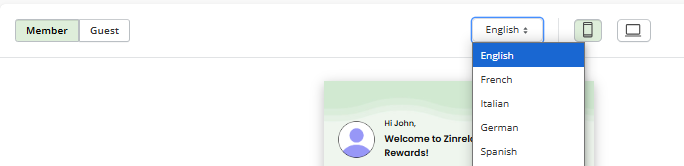
Note: To preview how your configuration changes will appear, you can easily switch between guest view and member view, as well as between desktop (embedded) view and mobile (popup) view.
Any modifications made to the theme and content panel are instantly reflected in the preview. However, you must save the changes first; otherwise, they will be lost if you navigate away.
If you are satisfied with the changes, please publish them. This will make them live for all customers.
If you are not satisfied, please discard the changes. This action will rollback the modifications to the last published state.
Theme Configuration
Customize your dashboard according to your brand's specifications with our comprehensive theme configuration options.
Global Settings
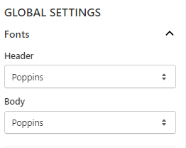
Fonts:
This menu allows you to choose fonts for both header and body sections globally.
Color Settings:
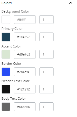
If you wish to make global changes to colors, you can use these settings. You can change the background, primary, and secondary colors, as well as the border color, primary text color, and secondary text color.
Within this setting, you can adjust colors by selecting them using a color picker or modifying hex codes and adjusting the color's opacity within the range of 0 to 1.
To know what all changes using different color settings, refer to this document.
Components
If you wish to customize individual components, you can access their settings here.
Button:
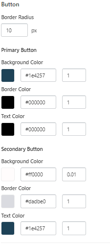
With this menu, you can configure the border radius and primary and secondary colors of buttons.
To have a detailed view of what changes with the primary and secondary colors of the button, please click here.
Background Color
This will change the background color of the template.
Primary Color
Member View
This setting will change the following components:
| Components | Images |
| Text color of "View Profile" | |
| Text color of "Points" | |
| Text color of "Back" | |
| Text color of "All, Spent and Earned" | |
| Button color of "Go back to profile page" in "Cancel Membership" page | |
| Text color of "Cancel Membership" in "Cancel Membership" page | |
| Icon color of "Arrow" | |
| Button color of "Redeem" | |
| Text color of "View all" | |
| Button color of "Earn points" | |
| Button color of "Confirm" | |
| Color of the "Header" for all pages except the homepage |
Guest View
This setting will change the following components:
| Components | |
| Color of “sign up” button | |
| Icon color of "Arrow" | |
| Text color of "View all" | |
| Text color of "Back" |
Accent Color
Member View
This setting will change the following components:
| Components | Images |
| Color of the "Tier card header" | |
| Color of the highlighted border for the current tier | |
|
The point expiration text |
Guest View
| Components | Images |
| Color of the "Header" for all pages except the homepage | |
| Color of the "Tier card header" |
Border Color
Member View
This setting will change following components:
| Components | Images |
| Border color of all cards | |
| Border color of "View Profile" | |
| Border color of "View points expiry" in My Profile page | |
| Border color of "View points history" in My Profile page | |
| Border color of "Cancel Membership" in My Profile page | |
| Border color of "All, Spent and Earned" | |
| Circle color of Progress Bar | |
| Border color of Tier Cards | |
| Border color of Rewards card | |
| Border color of "View all" | |
| Border color of Earn points card | |
| Border color of line between activities in tier benefits |
Guest View
| Components | Images |
| Border color of Rewards card | |
| Border color of "View all" | |
| Border color of Earn points card | |
| Border color of Tier Cards |
Header Text Color
Member View
This setting will change following components:
| Components | Images |
| Welcome message | |
| Points details | |
| My Profile header in My Profile page | |
| User Name in My Profile page | |
| View points expiry text, arrow, icon, and description text in my profile page | |
| View points history text, arrow, and icon in my profile page | |
| Cancel Membership text, icon, and arrow in my profile page | |
| Points Expiration" header text and "points expiring soon" text in Point Expiration page | |
| Points history header text, points, earned and spent activities, and rewards text | |
| "Cancel Membership" header text and "Are you sure you want to cancel your membership?" text in Cancel Membership page | |
| Tier Benefits header text, Tier information text, tier name, points data, and tier description in Tier Benefits page. | |
| Rewards text | |
| Qualifying activities text color in tier benefits | |
| Points details, first line of reward details and reward header text in reward section and reward page. |
|
| Earn points text, activity name, and earned points header text in earn points section and earn points page. |
|
| Activity name, points details, and first line description in activity page | |
| Tier name, tier details, and points details in tier section |
Guest View
| Components | Images |
| The welcome messages, points details text color and program description message. | |
| Points details, first line of reward details and reward header text in reward section and reward page. |
|
| Earn points text, activity name, and earned points header text in earn points section and earn points page. |
|
| Tier name, tier details, and points details in tier section |
Body Text Color
Member View
This setting will change the following components:
| Components | Images |
| "Enjoy current tier benefits" text in homepage | |
| Member details in my profile page | |
| Second line description in point expiration page | |
| Year, dates, order details, and point status text in points history page | |
| The description text in cancel membership page | |
| "Enjoy current tier benefits" and "Your Benefits" text in Tier Benefits page | |
| Second line of points details in reward section and reward page |
|
| Activity description in earn points section and page |
|
Guest View
| Components | Images |
| Text color of “Already a member” | |
| Second line of points details in reward section and reward page |
|
| Activity description in earn points section and page |
|
Button Configuration
Primary Button
Member View
This setting will change the background color, text color and border color of the following button:
| Components | Images |
| Change the color of the "All/Earned/Spent" button when clicked on in the point history page. | |
| Change the color of the reward button in the homepage and reward page. |
|
| Change the color of the "earn points" button in the homepage and earn points page. |
|
| Change the color of the "Go back to profile page" button in the "Cancel Membership" page. |
Guest Member
| Components | Images |
| The color of “sign up” button |
Secondary Button
Member View
This setting will change the background color, text color and border color of the following button:
| Components | Images |
| Change the color of the "View Profile" button. | |
| Change the text color of the "Back" button. | |
| Change the arrow color. | |
| Change the color of the unclicked buttons of "All/Earned/Spent" in the point history page. | |
| Change the color of the "Cancel Membership" button in the cancel membership page. | |
| Change the color of the "View All" button. |
Guest View
| Components | Images |
| The background, border and text color of “view all” button |
Link Button
Member View
| Component | Image |
| Change the text color of the “View Benefits” link button. |
Guest View
| Component | Image |
| Changes the text color of login link text |
Content
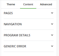
This section of the dashboard configuration facilitates the customization of text displayed across the EUD (End User Dashboard). Craft compelling narratives and streamline user interactions with our content customization options:
Pages:
Tailor the text displayed across various sections of the dashboard to resonate with your audience. You can finely tune every message, from the homepage to tier benefits, to reflect your brand's voice and values.
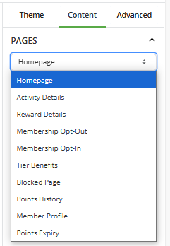
To have a detailed view of each page, click here.
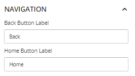
Navigation:
Enhance user navigation with personalized label text for home and back buttons.
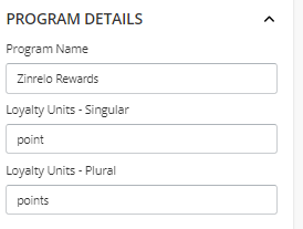
Program Details:
Reinforce your brand identity by customizing the program name and loyalty unit, both singular and plural, to align with your brand messaging.
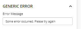
Generic Error:
Edit the generic error message which will be displayed when something goes wrong in EUD.
Once you are done with the changes, make sure to Save.
Note: Multilingual stores can select a language from the dropdown, make changes to each language, and then save and publish.
Advanced
This section provides tools for embedding the dashboard and implementing custom CSS changes.
Embed Dashboard
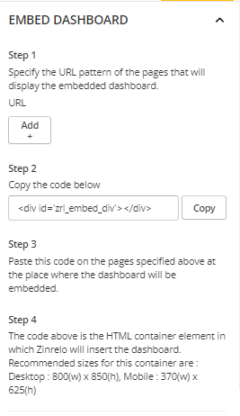
Here, you will find step-by-step instructions for embedding the dashboard on your website.
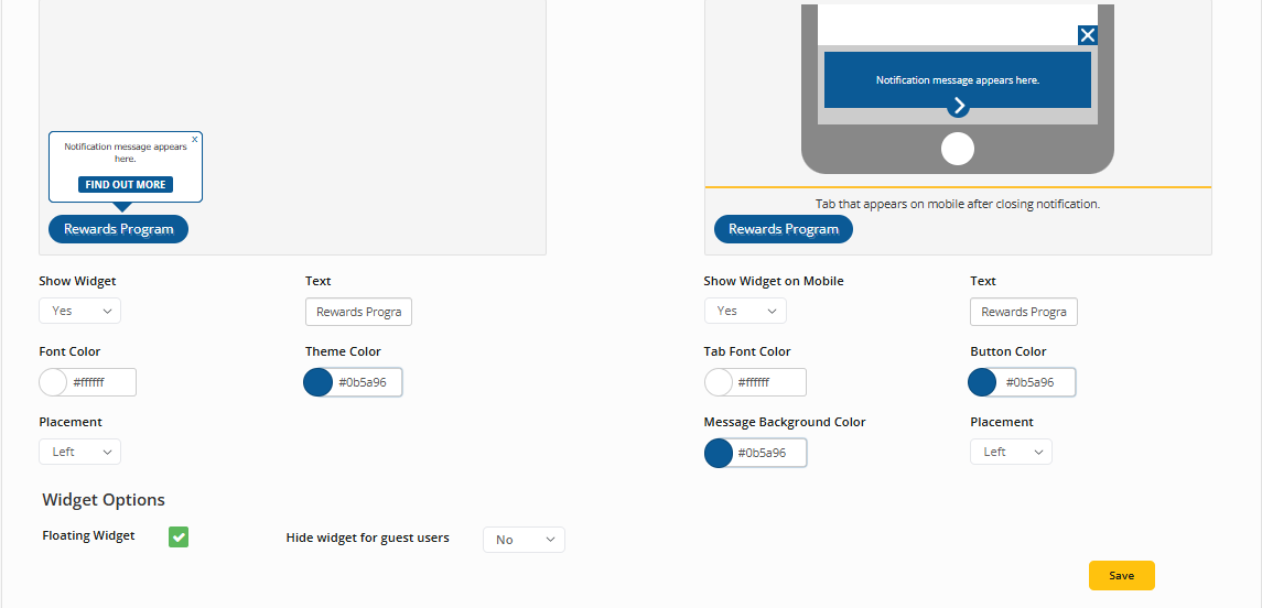
Alternatively, you can opt to render the dashboard as a pop-up. Instructions for configuring the pop-up widget are available in a separate section.
Go to Design >> Widget and Notification.
Custom CSS
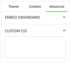
You have the flexibility to customize each component within the dashboard by uploading a Cascading Style Sheets (CSS) file. This means that if you prefer to make manual adjustments to individual components, you can do so by making CSS changes directly. This provides you with granular control over the appearance and styling of each element within the dashboard, allowing for precise customization tailored to your specific preferences and requirements.
📘
Please Note: The changes to custom CSS does not reflect instantly and it requires reload of the page to reflect.
📘
To configure CTA functionality to the dashboard, refer to this document.
Frequently Asked Questions
How to hide the confirm button from the rewards section?
To hide the confirm buttons from the EUD (End User Dashboard), please follow these steps:
- Go to the admin console, click on Design >> User Dashboard.
- Click on the Neo template.
- To customize the dashboard, click on 'Customize CSS.'
- Add the following CSS:
.reward-details[data-redemption_id="<reward id>"] #reward-confirm-btn{
display: none !important;
}- Save and Publish
📘
Note: Replace the 'reward_id' with the redemption ID you want to customize.
This will hide the confirm buttons from Reward EUD.
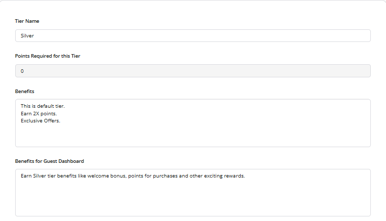
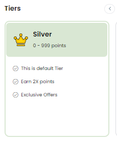
How to add tier benefits?
Go to Program Settings>> Tiers, then select the tier to configure its text.
How to add an avatar image?
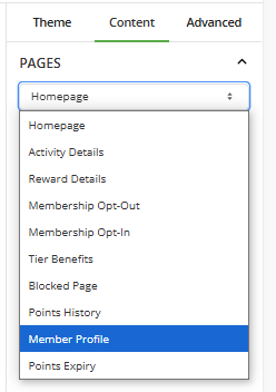
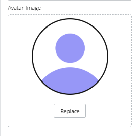
Follow these steps to add an avatar image:
- Click on the Content tab and locate the Member profile page.
- Add the avatar image to the provided section and Save.
How to upload a photo for rewards?
To upload a photo for a reward, follow these steps:
- Navigate to Program Settings >> Rewards.
- Click on the reward for which you want to change the image.
- Upload an image in the “Reward Tile Image” section and save.
Can I upload an image for activities?
To upload a photo for activities, follow these steps:
- Navigate to Program Settings >> Activities.
- Click on the activity for which you want to change the image.
- Upload an image in the “Activity Icon Image” section and save.
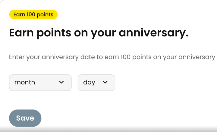
How can I hide the year from the anniversary bonus activity?
If you wish to hide the year from the anniversary bonus activity, follow these steps:
- Go to Program Settings >> Activities >> Anniversary bonus activity.
- Disable the "Ask for year of Anniversary" toggle button.
- Save your changes.
This action will hide the year from the activity, and members will only be asked to submit their anniversary month and date.
📘
Please Note: When users successfully meet the frequency rule for an activity, the system automatically hides that activity from the Activity tab on their dashboard.
Comments
Please sign in to leave a comment.